
If there's one thing I struggle with most in my art, it's color. I don't know if I just don't have the right eyes for understanding and creating aesthetically pleasing color display, or if there's some technique I'm not getting just right, but I feel that my color schemes just aren't as spectacular as I'd like.
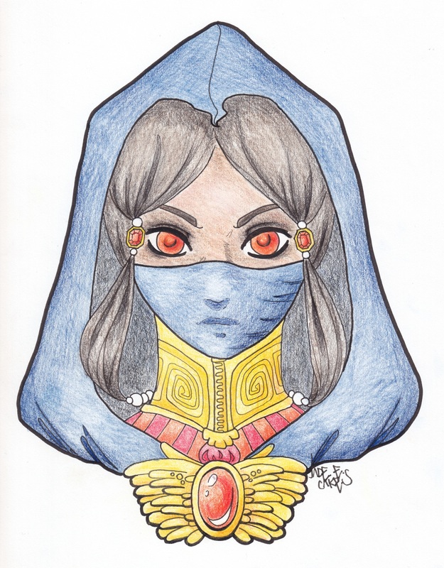
The picture above on the left is done digitally, and the one on the right is done with various sets of colored pencils. Obviously, the digital version has a cleaner, more uniform color. This is the major difference that can be noticed with this medium. However, the main distinction that I notice between the two, as a user, is the palette of colors that each medium provides. With colored pencils, one gets whatever color palette the manufacturers provide. You get a certain number of blues, a certain number of reds, and so on.
In digital coloring, you create your colors. Any color imaginable is at your fingertips. For many artists, this is a blessing. For me, this is far too overwhelming. If I try to create a color palette digitally, something about it just isn't what I want. Some color just isn't at the right saturation and I have no idea how to fix it. Sometimes I don't notice that a color is wrong until it's already in the picture.
I think of this as very similar to a problem I have with music. I have musical alexia; I am unable to read sheet music. I was given flashcards and lessons for years in an attempt to get me to learn, but I just couldn't grasp it. I also have no concept of what a D or a B or any other note sounds like. Luckily, I'm able to play by looking at patterns and playing by ear. I can also read tabs fairly well, so Lucy doesn't get too lonely.
It pains me to say it, but sometimes I think that I have some disability that prevents me from properly creating color palettes from nothing. Even if I try to create a digital palette beforehand and place them next to each other as a test, it takes me hours to create a few blobs that look together. Because of this, I usually prefer traditional media to digital. The colors that manufacturers give in a box of colored pencils or a set of inks ALWAYS goes together well. That's the point of selling them together (although admittedly, the pencils tend to look somewhat lego-y).
There are, however, some instances in which digital coloring works perfectly for me. For example, when writing comic books, especially those that are not meant to be serious, it is okay if my color schemes look a little goofy and over-saturated. In fact, The Adventures of Omnicakes was perfect for my goofy color scheme.
Luckily, the internet is a beautiful place, and many artists are willing to create color schemes for you. If you know how to look for them, you don't have to suffer. There are also a lot of tutorials out there for techniques. I'm particularly fond of the information that's found on DeviantArt, such as milkpoo's helpful guide to color picking, or Cpresti's well-designed unified color palette tutorial, something I really need to look at more often. Color is more complicated than it seems!
And now I'm going to spend the next three hours googling everything there is to know about color.

 RSS Feed
